Music
UPROXX Music
All Things Hip-Hop And New Music
UPROXX Indie Mixtape
Indie Music on UPROXX
UPROXX Pop Life
Pop Music on UPROXX
Listen To This
The Music You Need, Right Now
How Silent House Group Helped Tyler The Creator And Doja Cat Make Coachella Moments To Shout About
Lil Uzi Vert And Peso Pluma Brought Drag And Drama To Coachella 2024
How Vampire Weekend Mastered The Five-Albums Test
Film/TV
All Film/TV
UPROXX TV
Driving The Conversations Of Now
UPROXX Movies
Everything New And Important In Film
What To Watch
Know What’s Good In Streaming
‘Inside Out 2’: Everything To Know About The Pixar Sequel Including The New Emotions And Concept Art
Arkasha Stevenson On ‘The First Omen’ And The Scene That Got Her An NC-17
A Lovely Chat With Walton Goggins About ‘Fallout,’ ‘Justified,’ And Being A Solitary Man
Culture
will.i.am Launches FYI, The World’s First AI-Powered Messenger For Creative Collaboration
How Bail Bag Helps The Formerly Incarcerated Get Back On Their Feet
Advice From A Finance Pro For How To Survive (And Thrive) In This Economy
How will.i.am Developed ‘The Formula’ For The Future Of F1
Life/Style
UPROXX Life
Travel, Food, And Drinks On UPROXX
UPROXX Style
Style on UPROXX
The UPROXX Spring 2024 Travel Hot List
The Best Menu Hacks And Secret Menu Items At All The Big Fast Food Chains
‘Loud Budgeting’ Is The Savings Trend Taking Over TikTok In 2024
SNX: This Week’s Best Sneaker Drops Featuring The NOCTA Hot Step 2 Total Orange & Jordan 4 Vivid Sulfur
Sports
All Sports
Dime On UPROXX
NBA on UPROXX
UPROXX Edge
Gaming on UPROXX
UPROXX Brawler
MMA on UPROXX
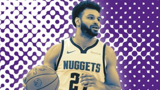
Jamal Murray On Championship Lessons And What Makes The Nuggets So Tough To Guard Late In Games
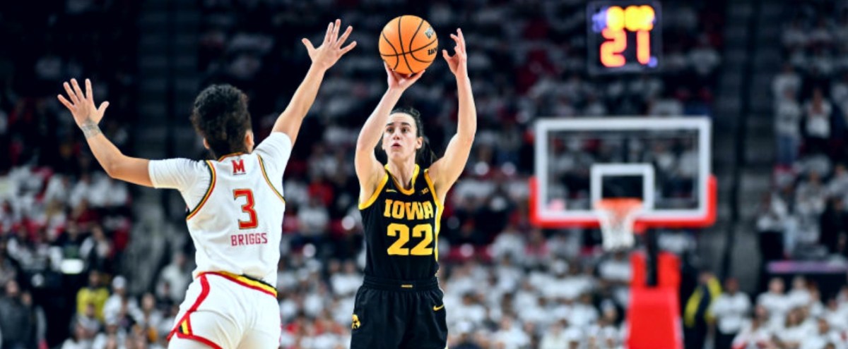
Jemele Hill On The Media Response To Caitlin Clark And The Women’s Basketball Boom
We Undersold How Good Victor Wembanyama Would Be As A Rookie
Drinks
All Drinks
Whiskey & Spirits
Whiskey & Spirits On UPROXX
Beer
Beer On UPROXX
Cocktails
Cocktails On UPROXX
The Absolute Best Bourbons Under $125, Ranked
The Absolute Best Scotch Whiskies Under $125, Ranked
We Ranked Salty, Tart Gose Beers To Drink This Spring
This Honey Hop From Our Upcoming Austin Takeover Is The Ideal Bourbon Cocktail For Warmer Weather
Video/Podcasts
Josh Levi Returns To ‘UPROXX Sessions’ With A Swaggering Performance Of ‘She Keeps Comin’
Feminist Synth Lab Is Making Music Accessible For The Marginalized
Paramore’s ‘Misery Business’ Gets Approval From Chlöe And Sexyy Red In The Return Of ‘React Like You Know’
Ice Cube Joins Katty Customs and Just Blaze In The Latest Episode Of ‘Fresh Pair’
…
Follow
YouTube
Instagram
Twitter
Facebook
Flipboard
AppleNews
Email
Search for:
Search
Info
About
Privacy
Terms
Cookies Policy
COOKIES SETTINGS
Takeaways From Each NBA Playoff Series After Game 1
NBA PLAYOFFS
The Most Important Player On Each Western Conference Team In The 2024 Playoffs
April 19, 2024
by:
Bill DiFilippo
The Most Important Player On Each Eastern Conference Team In The 2024 Playoffs
April 19, 2024
by:
Bill DiFilippo
THE ASSOCIATION
Jamal Murray On Championship Lessons And What Makes The Nuggets So Tough To Guard Late In Games
April 15, 2024
by:
Robby Kalland
The First Round Series In The 2024 NBA Playoffs, Ranked
April 18, 2024
by:
Robby Kalland
The Latest
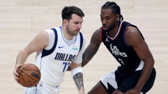
The Mavs Evened Up Their Series With The Clippers After A Game 2 Win
April 24, 2024
by:
Bill DiFilippo
Bobby Portis On The Pacers: ‘They’re Frontrunners, Bro’
April 24, 2024
by:
Bill DiFilippo
The Pacers Offense Came To Life In A Game 2 Win Over The Bucks
April 23, 2024
by:
Bill DiFilippo
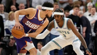
A Huge Night From Jaden McDaniels Gave The Wolves A 2-0 Lead Over The Suns
April 23, 2024
by:
Bill DiFilippo
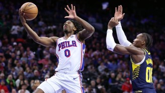
Tyrese Maxey Is The NBA’s 2023-24 Most Improved Player
April 23, 2024
by:
Bill DiFilippo
Featured
Bill Bradley Wants Our 'Common Humanity' To Become The Most Important Thing
by:
Bill DiFilippo
Jamal Murray On Championship Lessons And What Makes The Nuggets So Tough To Guard Late In Games
by:
Robby Kalland
We Might Have Undersold How Good Victor Wembanyama Would Be
by:
Robby Kalland
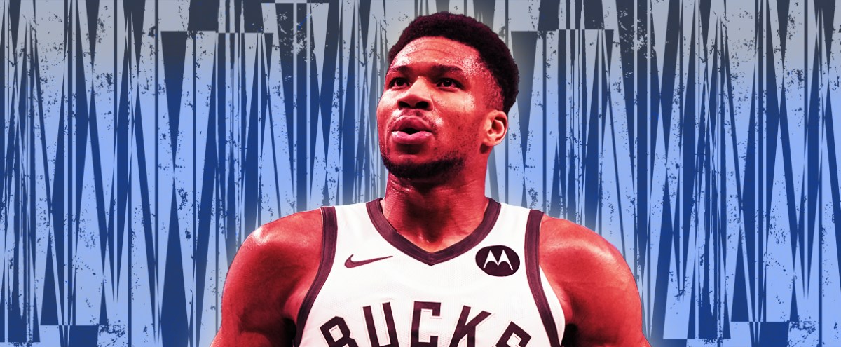
Giannis Antetokounmpo Talks About Why Comfort Is Just As Important As Pressure
by:
Katie Heindl
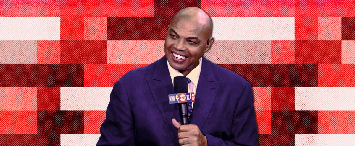
Charles Barkley On All-Star Saturday Night Memories And Regrettable Fashion Choices
by:
Robby Kalland
A Night At The Caitlin Clark Show
by:
Robby Kalland
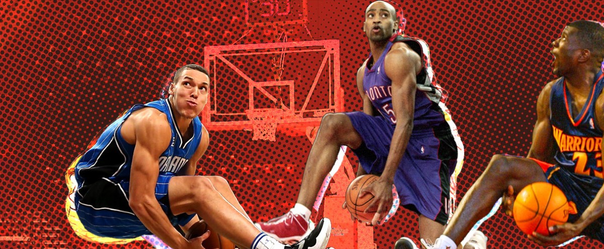
The 10 Best 50-Point Dunks In Dunk Contest History, Ranked
by:
Bill DiFilippo
The NBA Should Have The Three-Point Contest Close Out All-Star Saturday Night
by:
Bill DiFilippo
Jalen Williams Talks Defense, Chet Holmgren's Impact, And Ranking Thunder Players 'Call Of Duty' Skills
by:
Robby Kalland