We’re getting closer and closer to the start of the 2022 World Cup in Qatar. Thursday ended up being a big day on the road to the World Cup, as Nike announced the kits that its 13 participating teams will wear as they take the pitch this winter.
Some of them are pretty good, while others are very, very bad. To celebrate the occasion, we decided to rank all 13 of the kits that Nike announced.
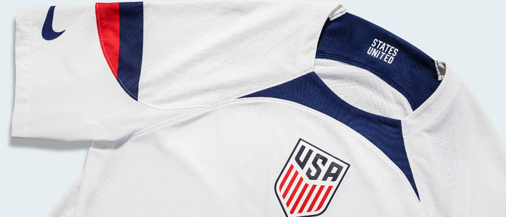
13. United States
🚨 NIKE HAVE OFFICIALLY ANNOUNCED THE 2022 USMNT KIT FOR THE WORLD CUP IN QATAR 🚨 pic.twitter.com/5mvJz2WVBh
— USMNT Only (@usmntonly) September 15, 2022
When multiple players take to social media to talk about how upset they are about these before they are even announced, you know something went wrong. Most of my thoughts can be read right here, but one more thing: What the heck is up with that bib on the white kit? Nike went with this on a number of these, and in my opinion, it does not work. Also, per Brian Straus of Sports Illustrated:
According to Nike, the minimal design flourishes on the white jersey are supposed to evoke other popular American team sports. The company’s logo is on each sleeve rather than the right breast, and so is intended to reflect American football jerseys. The centered U.S. Soccer crest is “akin to basketball jerseys,” Nike said, while the shoulder and sleeve seams are supposed to resemble those found on hockey uniforms.
Just make soccer jerseys.
12. Canada
Canada will rock the same kits for the World Cup as they did in qualifying 🇨🇦 pic.twitter.com/UYcEnCP9K0
— UNINTERRUPTED Canada 🇨🇦 (@UNCanada) September 15, 2022
Canada is wearing the shirts they wore during World Cup Qualifying, which saw them come in first place in CONCACAF. They are boring. This is your first trip to the World Cup since 1986! It’s your second time ever making it! Your best players — Alphonso Davies, Jonathan David — are some of the coolest players in the world! These can, and should, be so much better.
11. Poland
https://twitter.com/Footy_Headlines/status/1570378919429169152
Similar issue to Canada, these are just a little better, with the sleeves giving them the edge. Still, boring.
10. The Netherlands
The Netherlands have unveiled the kits they'll be wearing at the World Cup this winter. pic.twitter.com/TvbfM0dvFQ
— Get Belgian & Dutch Football News (@GBeNeFN) September 15, 2022
Again, the bib, what are we doing here? As for the home kit, they look like they are made out of satin. Hard pass.
9. South Korea
… and South Korea 🇰🇷 and Australia 🇦🇺
And that’s in addition to the Brazil kit that was previously unveiled this summer https://t.co/8IWt9f9lWc pic.twitter.com/wIghBTgcr5
— SI Soccer (@si_soccer) September 15, 2022
This is the only photo I could find of the South Korea kits. I don’t have too much to say about them. Son Heung-min is going to wear them, which helps them a lot, because he rocks. I can say that because his team did not play my team this past weekend due to the passing of Queen Elizabeth, and because of his poor form this season mixed with his general ability to terrorize Manchester City, he was -100000 to score twice in a Tottenham win if the game went on.
8. England
England have dropped their World Cup kits 🏴 pic.twitter.com/5ynl1eLTpO
— 433 (@433) September 15, 2022
God, these are so close. If they didn’t do the gradient thing (or anything!) on the shoulders of the home kit and stayed away from the — just making up a color here — thermonuclear blue on the away kits, I would adore both of these, especially because a clean shirt with a collar is something I will love 100 times out of 100. Instead, both of those things lead to these kits getting knocked down. If only “lots of potential but ultimately comes up short” described literally anything else about England’s national team.
7. Australia
The Australia home and away.
'The home kit conjures the rugged, sandy landscape of the Outback and the rich wetlands and forests.'
'The away kit is a homage to the Australian coastlines and teeming ocean.' 🇦🇺 pic.twitter.com/gjlAbpTMZA
— Classic Football Shirts (@classicshirts) September 15, 2022
My main gripe here is the crest is just way too big, but that’s a general gripe with what the Socceroos wear. The bib on the away kit is an issue that exists with a number of these, but here it works so much better because of the contrasting blues. The yellow and green on the home kit is sensational. If only the goalkeepers were wearing them so their ultra-annoying and extremely funny national hero Andrew Redmayne could wear it, too.
6. Portugal
Portugal’s 2022 World Cup kits are here 🇵🇹 pic.twitter.com/Jt5WEedC3W
— B/R Football (@brfootball) September 15, 2022
Portugal’s cream-colored away kit has really grown on me since they were first dropped — it’s a unique design with colors that work together, even if I wish the sleeves didn’t have the black ring on the end of them. They are legitimately very good. The home shirt, however, is a big “absolutely not” from me. It’s meant to mimic the country’s flag, and I guess the bet they made was this would look better than actually doing a vertical stripe, a la Portugal’s flag? I don’t know, just doesn’t work, especially the fact they tried doing it on both the shirt and its right sleeve.
5. Saudi Arabia
Looks a bit like Newcastle's third shirt, doesn't it? pic.twitter.com/8g9mOhdzGT
— FootballJOE (@FootballJOE) September 15, 2022
I am a sucker for a green/white color scheme and these scratch that itch in a big way. The home kit is a little boring but generally works, the away kit is spectacular, as the dark green base with light green accents really, really pops. There is a non-zero chance that Saudi Arabia does not earn a single point and it would take a whole lot of things breaking their way for them to make it out of their group, but they do have some really solid kits, which indeed counts for something.
4. Qatar
Qatar’s World Cup kit by Nike. بساطة🤩 pic.twitter.com/4KiyuYiXnw
— Samuello (@bigmuello) September 15, 2022
The hosts are participating in the World Cup for the first time by nature of being the host country, and they’ll do it in some pretty good threads. It’s a bit of a controversial opinion, but I love a good centralized crest, and Qatar’s home kit mixes that with design on the sleeve that evokes their flag. They’re getting knocked a touch because I’m not in love with the away kit blending white and the shade of yellow that is meant to mimic sand, but otherwise, these are great.
t-2. Brazil, Croatia
Brazil’s home and away kits for the 2022 World Cup 🇧🇷 pic.twitter.com/dyqCXiN7Jx
— B/R Football (@brfootball) August 9, 2022
Nike and Croatia just released their new kits for the 2022 World Cup 🇭🇷 pic.twitter.com/7dTy7cj3sS
— VERSUS (@vsrsus) September 15, 2022
Both of these run into the exact same issue. One shirt (the yellow home shirt for Brazil, the blue away shirt for Croatia) is phenomenal. The Croatia shirt, specifically, is absolutely unreal, to the point that I am considering purchasing it. But while the blue Brazil shirt and the checkerboard Croatia shirt are both very good on their own, there’s just a little too much messing with perfection going on here — the ultra-vibrant green on the sleeves of the former and the fact it’s not a solid checkerboard on the latter knock them both down a peg. Generally, though, these are spectacular.
1. France
Nike and France just dropped their new kits for the 2022 World Cup 🇫🇷 pic.twitter.com/MxcZTX7YHG
— VERSUS (@vsrsus) September 15, 2022
Clean, classic, timeless. The defending World Cup winners are going to look as good as ever in Qatar this year. Honestly, if every country took cues from France on how to take their standard shirts and add a few little tweaks — the landmarks and little nods to the French flag on the white one, specifically — my job would have been much more difficult here.